

Click any AI tool above to instantly get a summary of this article. Perfect for quick insights when you're short on time.
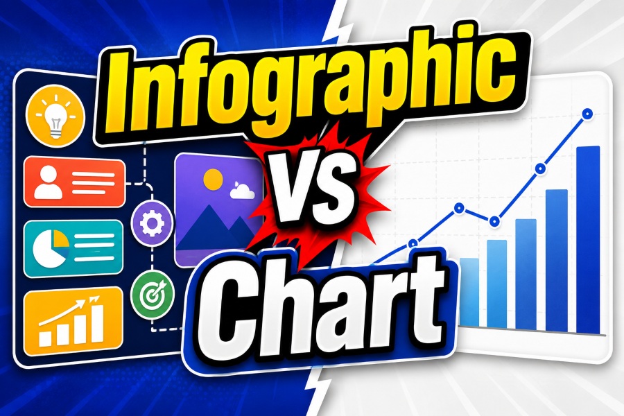
Infographic vs chart is a common comparison when people decide how to present information visually. Both formats help readers understand complex ideas, but they solve different communication problems. A chart focuses mainly on displaying data relationships, patterns, and comparisons, while an infographic combines visuals, text, and storytelling to explain a broader message.
Choosing the right format affects how quickly your audience understands your information. Businesses, educators, marketers, and researchers use both methods, but they apply them in different situations. This guide explains the differences between infographics and charts, when to use each one, and how combining both can create stronger visual communication.
What Is The Difference Between Infographic Vs Chart?

The main difference between an infographic and a chart is the purpose behind each visual format. A chart presents structured data in a way that allows viewers to identify trends, compare values, or analyze relationships. An infographic communicates a complete idea by combining data, illustrations, icons, and written explanations into a visual story.
Charts are commonly used when accuracy and comparison matter most. For example, a company tracking quarterly revenue may use a line chart to show sales growth over time. The viewer studies the numbers and draws conclusions based on the information presented.
Infographics work differently because they guide the reader through information. Instead of showing only numbers, they provide context and explain why the information matters. A health organization explaining the effects of exercise may combine statistics, illustrations, and short explanations in an infographic.
The difference becomes clearer when you consider the audience’s goal. Someone analyzing business performance needs a chart because they want precise information. Someone learning about a complex topic may prefer an infographic because it simplifies the subject.
A chart usually answers questions like:
- What changed?
- How much did something increase or decrease?
- How do different values compare?
- What patterns exist in the data?
An infographic answers questions like:
- What should people know about this topic?
- How can complex information become easier to understand?
- What story does this information tell?
Modern digital communication increasingly combines both formats. Many successful reports and marketing materials use charts inside infographics because data provides credibility while design improves understanding.
Must-know Tip: A chart helps people analyze information, while an infographic helps people absorb and remember information. The best choice depends on whether your audience needs analysis or explanation.
Visual communication continues growing across industries. Recent design trends show that organizations increasingly rely on visual content because people process visual information faster than large amounts of written text. Research in information design shows that effective visuals reduce cognitive effort and improve decision-making when information becomes complex.
For creators who need a faster way to transform ideas into visual content, AI-powered design platforms are changing how people create educational graphics. Tools that help users build top-quality infographics from ideas allow marketers, educators, and businesses to turn concepts into structured visual content without starting every design manually.
When Should You Use A Chart Instead Of An Infographic?

A chart is the better option when your primary goal is to display measurable information clearly. Charts remove unnecessary details and allow readers to focus on relationships between numbers, categories, or time periods.
Businesses depend heavily on charts because decision-makers often need accurate information quickly. Financial teams use charts to review revenue performance, marketing teams analyze campaign results, and product teams track user behavior through visual reports.
Different chart types serve different purposes. Selecting the correct chart improves understanding.
Common Chart Types And Their Best Uses
Bar Charts
Bar charts compare values between different categories. They work well when you want to show differences between products, locations, departments, or groups.
For example, a company comparing monthly sales across five regions can use a bar chart because readers can quickly identify the highest and lowest-performing areas.
Line Charts
Line charts show changes over time. They are useful for tracking growth, decline, seasonal patterns, and long-term trends.
A website owner monitoring traffic growth over twelve months can use a line chart to understand whether visitors are increasing or decreasing.
Pie Charts
Pie charts display proportions within a whole. They work best when showing simple percentage breakdowns with limited categories.
For example, a survey showing customer preferences among four options can use a pie chart.
Scatter Plots
Scatter plots reveal relationships between two variables. Researchers and analysts often use them to identify connections or possible trends.
A company studying advertising spending and sales performance may use a scatter plot to determine whether increased investment relates to higher revenue.
Charts are especially valuable in professional environments where accuracy matters. However, charts have limitations. They usually require existing knowledge from the reader, and they may not explain the background behind the numbers.
A chart showing declining customer retention does not automatically explain why customers are leaving. The audience must investigate additional information to understand the reason.
Must-know Tip: Use charts when your audience already understands the topic and needs accurate information to make decisions. Use infographics when your audience needs guidance and explanation.
The use of data visualization continues increasing as organizations collect more information. By 2025, businesses worldwide are expected to generate and analyze hundreds of zettabytes of data, creating greater demand for clear visual reporting methods. Charts remain one of the most effective ways to transform large datasets into understandable insights.
How Infographics Communicate Information Differently From Charts
Infographics are designed for explanation, education, and storytelling. Unlike charts that focus mainly on numerical relationships, infographics combine multiple visual elements to create a complete message.
A successful infographic usually contains:
- A clear headline
- Supporting visuals
- Short explanations
- Statistics or facts
- A logical reading flow
- Visual hierarchy
The purpose is to help readers understand information without requiring advanced knowledge of the subject.
For example, imagine explaining climate change. A chart may show rising global temperatures over decades. An infographic can expand the explanation by showing temperature changes, causes, effects, and possible solutions in one visual experience.
Infographics are widely used in content marketing because they increase engagement and improve information retention. Marketers use them to simplify industry research, explain products, and present educational content in a shareable format.
Another important difference is storytelling. Infographics lead readers through information step by step. Designers carefully arrange sections so the audience understands the main idea before moving to supporting details.
Charts usually present information without a narrative structure. They provide evidence, but they do not always explain the larger context.
For example, a chart may show that online shopping increased by 40% over several years. An infographic can explain why that happened by including changes in consumer behavior, technology adoption, and business strategies.
Must-know Tip: If your audience needs to remember a message after viewing the content, an infographic usually performs better because it connects information with visual storytelling.
The demand for visual storytelling continues expanding. Social media platforms, websites, and digital publications increasingly prioritize visual formats because users often spend less time reading long text-based explanations.
Why Businesses Combine Charts And Infographics In Visual Communication
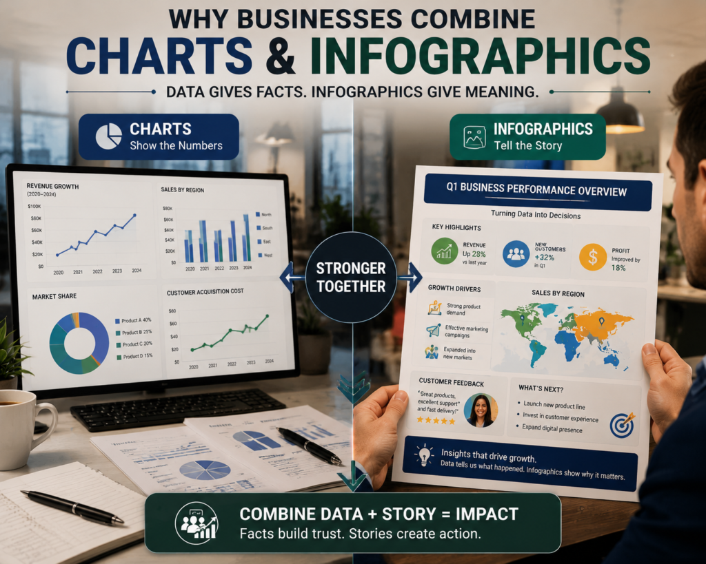
Many organizations no longer choose between charts and infographics because combining both formats creates stronger communication. A chart provides evidence, while an infographic provides meaning and context. Together, they help audiences understand information faster and remember important points longer.
A business report is a good example of this combination. A marketing team may use charts to show website traffic growth, conversion rates, and customer acquisition costs. The same report may include infographic elements that explain campaign strategies, customer behavior changes, and important recommendations.
This combination works because people need both facts and explanations. Numbers alone may not create understanding, while attractive visuals without accurate information may reduce trust.
A strong visual communication piece follows a simple structure:
- Start with the main message.
- Support the message with reliable data.
- Use charts to display important numbers.
- Add infographic elements to explain meaning.
- Guide readers toward the correct conclusion.
For example, a healthcare organization explaining vaccination trends may include a chart showing vaccination rates across different years. The infographic design can then explain causes, benefits, safety information, and public health recommendations.
This approach is becoming more common because modern audiences expect information to be both accurate and easy to consume. Digital users often scan content before deciding whether to read further, making visual hierarchy essential.
A report from the content marketing industry shows that visual content remains one of the most effective formats for increasing engagement. Studies consistently show that articles containing relevant visuals receive significantly higher interaction compared with text-only content.
The growth of artificial intelligence is also changing how professionals create combined visuals. AI tools can now assist with layout suggestions, data interpretation, and infographic generation, allowing creators to focus more on strategy and accuracy.
Must-know Tip: Do not add charts to an infographic just because data exists. Every visual element should support the main message and help readers understand the information.
The best visual content does not simply display information. It organizes information in a way that matches how people learn, compare, and make decisions.
How To Choose Between A Chart And An Infographic For Your Content
Choosing between a chart and an infographic depends on your goal, audience, and the type of information you need to communicate. Many content creators make the mistake of choosing a format based only on appearance instead of considering the reader’s needs.
A chart is the better choice when:
- You need to compare numerical values.
- Your audience requires detailed analysis.
- The information changes frequently.
- Accuracy is more important than storytelling.
- Readers already understand the topic.
An infographic is the better choice when:
- You want to explain a complex idea.
- Your audience needs educational content.
- You want information to be easily shared.
- You need to simplify a process.
- The topic requires context.
Consider Your Audience Before Selecting A Format
Your audience determines how much explanation your visual requires. Experts reviewing financial data may prefer detailed charts because they already understand the subject. General audiences often need infographics because they require additional context.
For example, an investment analyst reviewing stock performance needs technical charts. A beginner learning how investing works may benefit from an infographic explaining basic concepts.
Consider The Information Type
The type of information also affects your decision.
Use charts for:
- Statistics
- Measurements
- Comparisons
- Trends
- Research results
Use infographics for:
- Processes
- Educational topics
- Step-by-step explanations
- Industry summaries
- Visual guides
The wrong choice can reduce understanding. A complicated infographic filled with unnecessary illustrations can make simple data harder to interpret. A chart without explanation can confuse readers who need background information.
Must-know Tip: Start by asking one question: “Does my audience need to analyze this information or understand this information?” Your answer usually determines the right visual format.
The rise of data-driven decision-making has increased demand for both formats. Organizations now create thousands of reports, presentations, and marketing materials each year that require clear visual communication.
Tools And Best Practices For Creating Effective Charts And Infographics
Creating effective visuals requires more than selecting a design template. The creator must understand the purpose, audience, and information structure before choosing colors, layouts, or visual elements.
Different tools support different needs. Chart-focused tools help users organize and analyze numerical information, while infographic platforms focus on visual storytelling and design flexibility.
When creating charts, focus on:
- Accurate data representation.
- Appropriate chart selection.
- Clear labels.
- Simple formatting.
- Avoiding misleading comparisons.
When creating infographics, focus on:
- Strong visual hierarchy.
- Limited text.
- Consistent design elements.
- Logical information flow.
- Readable typography.
A good infographic does not include every available fact. It selects the most important information and presents it in a way that supports understanding.
A good chart does not use unnecessary decoration. It removes distractions so readers can focus on the data.
For example, adding excessive colors, three-dimensional effects, or decorative elements can make charts harder to read. Similarly, adding too much text to an infographic can reduce its effectiveness.
Modern creators also use AI-powered platforms to speed up visual production. These tools help transform written ideas into structured designs, but human review remains necessary to verify accuracy and improve clarity.
The best workflow combines technology with human judgment:
- Define the purpose.
- Understand the audience.
- Organize information.
- Select the right format.
- Review the final design.
Businesses that publish educational content can also benefit from creating different types of visual assets for different channels. A detailed chart may work well in a professional report, while a simplified infographic may perform better on social media.
Must-know Tip: Design decisions should support understanding, not decoration. Every color, icon, and data point should have a clear purpose.
Common Mistakes When Creating Charts And Infographics
Many visual communication problems happen because creators focus on design before understanding the information. A visually attractive graphic can still fail if it confuses the audience or presents information inaccurately.
One common mistake is choosing the wrong format. Some creators use infographics for simple data comparisons that would be clearer as charts. Others use charts when the audience needs explanation and context.
Another mistake is overcrowding visuals. Adding too many statistics, icons, colors, and messages creates cognitive overload. Readers struggle to identify the main point when every element competes for attention.
Mistakes To Avoid In Charts
Poor chart design often includes:
- Missing labels.
- Incorrect scales.
- Too many categories.
- Unnecessary visual effects.
- Confusing color choices.
A chart should make information easier to understand, not force readers to spend extra time interpreting it.
Mistakes To Avoid In Infographics
Poor infographic design often includes:
- Excessive text.
- Weak storytelling.
- Decorative visuals without purpose.
- Lack of clear structure.
- Too many unrelated ideas.
A successful infographic creates a smooth reading experience. Each section should naturally lead the audience to the next point.
Accessibility is another important consideration. More organizations are improving digital accessibility by using readable fonts, proper contrast, and alternative descriptions for visual content.
Recent accessibility trends show that organizations are paying more attention to inclusive design because digital information must work for users with different abilities and devices.
Must-know Tip: A visual is successful when the audience understands the message quickly, not when the design looks complicated.
The future of visual communication will continue moving toward simpler, clearer, and more personalized experiences. AI-assisted design, interactive dashboards, and automated reporting are making it easier to create visuals, but effective communication principles remain unchanged.
Infographic Vs Chart: Which One Should You Use?
Infographic vs chart decisions depend on what you want your audience to achieve after viewing your content. Neither format is universally better because each serves a different purpose.
Choose a chart when you need to present information that requires comparison, measurement, or analysis. Charts work especially well for professionals who need accurate data to support decisions.
Choose an infographic when you need to explain a topic, educate an audience, or communicate a story. Infographics are effective when readers need context before they can understand the information.
In many cases, the strongest solution combines both approaches. A report may use charts for detailed analysis and infographic elements for summaries and explanations.
Before creating your visual, consider:
- Who will view it?
- What information do they need?
- What action should they take?
- Do they need facts or explanation?
- Which format makes understanding easier?
Businesses, educators, and marketers increasingly rely on visual communication because information continues growing in volume and complexity.
A well-designed chart can reveal patterns hidden inside data. A well-designed infographic can transform complicated information into a message people remember.
The goal is not choosing the most attractive option. The goal is choosing the format that communicates your information clearly and effectively.
Must-know Tip: The best visual format is the one that helps your audience understand the message with the least effort.
Conclusion
Infographic vs chart comparisons show that both visual formats solve different communication challenges. Charts focus on accuracy, comparison, and data analysis, while infographics focus on explanation, storytelling, and audience engagement. Choosing the right format helps you present information in a way that matches your audience’s needs.
Use charts when your goal is to display measurable information and help readers identify trends or relationships. Use infographics when you need to simplify complex ideas and create a memorable learning experience. Combining both formats often creates the strongest results because data provides credibility while design improves understanding.
As digital content continues becoming more visual, organizations must learn how to communicate information clearly. The most effective visuals are not the ones with the most elements. They are the ones that deliver the right message quickly, accurately, and naturally.
Understanding the difference between infographic vs chart helps you create better reports, presentations, marketing materials, and educational resources. When you select the right format, your audience spends less time trying to understand information and more time using it effectively.
Frequently Asked Questions
What Is The Main Difference Between An Infographic And A Chart?
An infographic combines text, visuals, and data to explain a complete idea, while a chart focuses mainly on displaying numerical information and relationships between values.
Is A Chart Considered An Infographic?
A chart can be included inside an infographic, but a chart alone is not usually considered an infographic because it does not typically include storytelling elements.
When Should I Use A Chart?
You should use a chart when you need to compare data, identify trends, analyze measurements, or present information that requires accuracy.
When Should I Use An Infographic?
You should use an infographic when you need to explain a topic, educate an audience, simplify complex information, or create shareable visual content.
Are Infographics Better Than Charts?
Infographics are not always better than charts. The best choice depends on whether your audience needs explanation or data analysis.
Can An Infographic Include Charts?
Yes. Many infographics include charts, graphs, and statistics to support the main message and improve credibility.
Which Is Easier To Understand, A Chart Or An Infographic?
Infographics are often easier for beginners because they provide context, while charts are usually easier for people analyzing specific data.
Do Businesses Use Charts Or Infographics More?
Businesses use both. Charts are common in reports and analytics, while infographics are popular in marketing, education, and communication campaigns.
What Makes A Good Chart?
A good chart uses accurate data, clear labels, appropriate formatting, and a design that helps readers understand the information quickly.
What Makes A Good Infographic?
A good infographic has a clear message, organized information, strong visual hierarchy, readable design, and relevant supporting visuals.
Are AI Tools Useful For Creating Infographics?
AI tools can help generate layouts, organize ideas, and speed up design processes, but human review is still needed for accuracy and quality.
Do Charts Improve Decision-Making?
Yes. Charts help decision-makers identify trends, compare results, and understand patterns in large amounts of information.
Are Infographics Good For SEO?
Yes. Well-designed infographics can improve engagement, increase sharing, and support content marketing strategies when they provide valuable information.
What Is Better For Social Media, Charts Or Infographics?
Infographics often perform better on social media because they combine visual appeal with educational value, making them easier to share.
Can I Use Both A Chart And An Infographic Together?
Yes. Combining charts with infographic elements creates a balanced visual that provides both accurate data and easy-to-understand explanations.

Comments
0 responsesNo comments yet. Be the first to share your thoughts.